- "Costing little labor or trouble"
- "Charging low prices"
- "Stingy; miserly"
- "Of little account;of small value; shoddy"
...just to name a few. For the most part, most of the definitions involve money in some shape or form. But the last definition, "Of little account; of small value; shoddy", seems to imply something else entirely. This definition seems to defy the nickels, dimes, and dollars and focuses more on specific, outward qualities of the item in question. Just word "shoddy" conjures up less than savory images of some object that has either fallen into a state of disrepair, is victim of poor workmanship or quality, or has been treated badly or abused. very few people would be proud to have this adjective associated with their home, car, clothing, dog, or any other personal possession.
I've always been a big believer that there is a difference between the words "inexpensive" and "cheap". Just because something is inexpensive doesn't mean it needs to look cheap in its outward appearance.
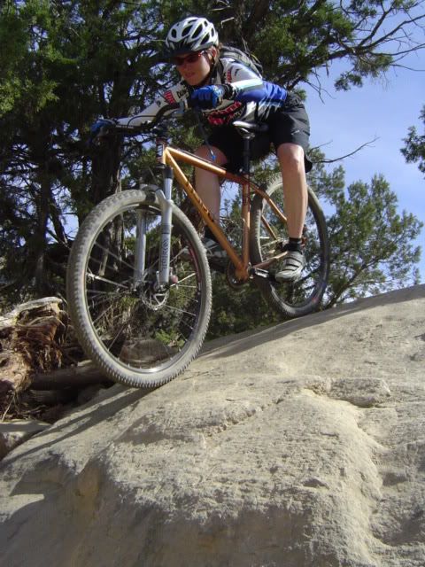
Over the years working in the cycling industry, I have made an interesting observation about the graphic treatments on many brands of bicycles. There seems to be this unwritten rule somewhere that many Product Managers live by that says mountain bikes under the retail price point of about $800 must include contrasting two-tone paint, bold graphics with brand names screaming on the downtubes, and garish colorways? I mean, some of these things are enough to cause someone a seizure. Is this what consumers in this category really want?
Don't get me wrong, Haro was not immune to this strategy. Our popularly-priced V-Series line has met all of the above criteria for many years. Did it makes these bikes dogs? Of course not. But based on feedback we received from our dealers and sales reps, we decided that it was time to give the good 'ol V-Series bikes a bit of a face lift to give them more personality and have them stand out in the sea of screaming two-tone bikes in the under $800 retail range.
As a Brand Manager, this V-Series re-design has been pretty darn fun. We started with a brand new name. Since the V-Series name was somewhat dated and lacked personality, we set out on a journey to find a new name. Mind you, the whole bike model name picking process isn't exactly a picnic. It's a long and involved process of research, discussion, thought, voting, and sometimes even bickering. And in the end, there's usually not a clear-cut winner that everyone agrees upon. In the case of this project, we got fairly lucky that a name stood out among the crowd. We decided on the name "Flightline"; which was named after our local network of trails which shared the same name about a mile from the office where many of us rode on a daily basis. Unfortunately, the owners of this precious piece of land felt that we needed a few more business parks and industrial buildings in the area, so our beloved trail network is now being bulldozed in preparation for development. We felt the name "Flightline" would be a fitting tribute and would serve to tell a story.
We also decided to ditch the two tone paint on all models in favor of hipper, monotone colorways. Since black is the new black, we've got quite a few of black bikes in the line. Most of our dealers tell us they can sell black bikes all day long, so black it is. I pulled a few "hit" colors from the higher-end MTB line into this new line and added some new, fun colors as well. We've got Harlot Red (just a nice, deep red), Creme Brulee (looks just like the yummy dessert), and Sasparilla (a semi-metallic bronze-ish color) just to name a few. OK, I'll be a girl for just a moment and say that I really enjoy picking colors!
The next step in the re-design process was the development of the new Flightline graphics. In effort to update the model's image and have them stand out in the crowd, we wanted to develop clean, simple graphics along the line of what we use on our higher-end mountain bikes. I gave Rick, our in-house graphic designer, a few guidelines and ideas of what I was looking for. He retreated into his lair and began to work his magic. After a few days in artistic isolation, Rick emerged with about 15 different looks for us to choose from. And what really sucked about that is they were all great. It was pretty hard to choose just one. After a few hours of debate, we did choose a winner; the beauty of it all was we now have 14 other graphic packages just waiting in the wings to be used for other projects. Rick did an amazing job. Our final Flightline graphics are clean, simple, and sophisticated. A far cry from the seizure-inducing V-Series graphics of old.
By now, you probably expect to see some photos of the new Flightline bikes or maybe even some digital renderings. Nope. We're going to officially unveil the new line to our dealers and the public early April, so they're going to stay under wraps for the meantime.
During this whole cosmetic re-design process, my goal was to create a line of bikes that even though they are relatively inexpensive, wouldn't look cheap. We wanted to create bicycles that customers would perceive as valuable and be proud to own. I hope our customers like our new Flightline series as much as we do; we certainly had a good time creating them.
3 comments:
Awesome commentary and insight. I guess I have to step up my game and do some similar story telling.
Damn you Hamilton!
just stumbled on you from Tim's site...I am a Haro dealer in Perth Australia, do you design the bikes we get here ?
Hi Nick,
As Brand Manager, I'm not really a bike designer...that's what our Product Managers do. But I am responsible for the direction of spec, graphics, colors, and overall image of the Haro MTB line. I guess you could say that my job is 75% marketing and 25% product related.
Nice to hear from a dealer Down Under!
Post a Comment